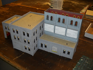
This project was the modification of a DPM classic -- FedUps Freight. On my layout, it got bumped out of its original spot for the new, larger freight house and I wasn't sure I was going to have a place for it. But when I started finalizing placement of buildings in the Chicago section of the layout, this building fit nicely in an open spot except for one problem -- it was too short on the right side. My Chicago layout is based heavily on an Art Curren design published in Model Railroader in December 2000 (or maybe is was 1999, I don't recall). It's a large peninsula with tall buildings running down the middle acting as a view block. Each side of the building is painted differently so that it looks like a completely different set of buildings depending on which side you are on.
For this building to work, I needed to bring the height of the right side of the building (as pictured) up several stories.
Here's the starting point:
I put together some extra DPM sections, using extra Testors glue in the joints to strengthen them.
Here's the rough mockup. I had to do some creative shaving off the sides here and there and I didn't use any pilasters on the one side to make it butt up against the existing building. I think this building was also the first major kit I ever put together, so the construction isn't exactly high quality and things weren't perfectly square.
Once I was happy with the basic fit, I used an Xacto knife with a chisel blade to scrape a bit of the roofing material off (sand in this case) so the glue on the bottom of the addition would have something to stick to.
I primed it grey...
And then painted it a grey that was somewhat close to the original color and included some big white spaces to add signage and a bit of decoration. I also figured that since the color wasn't an exact match, adding some additional interest with the white would make it look a little more natural.
I cut a piece of styrene using the upside down addition (before I glued it on!) to get the shape right. I also wasn't sure what I wanted the building to be. It does not receive any rail service, so it wouldn't affect my operations regardless. I went through my decals and found "Heritage Furniture". I figured with the two-tone building with the big white squares, it made sense that it might be something more consumer oriented. So now the building transformed into a furniture factory and warehouse.
A view from the back. The back will be a different business.
The front...
I also was never happy with the roof. I used sand and it never looked quite right. I went over the sand with fine buff ballast and it looked a lot better.
I added a small water tower and a lot more roof vents. I painted the front of the water tower grey and white, while the back is red and white. You can just see part of the one red square.
I painted the back a washed and weathered red. Note the water tower from this angle. I'm not sure what this side is going to be. I'll worry about it when I get to that side of the layout.


Comments